
Bright lights. Clear sightlines. Full staff visibility. So why is the room still so quiet?
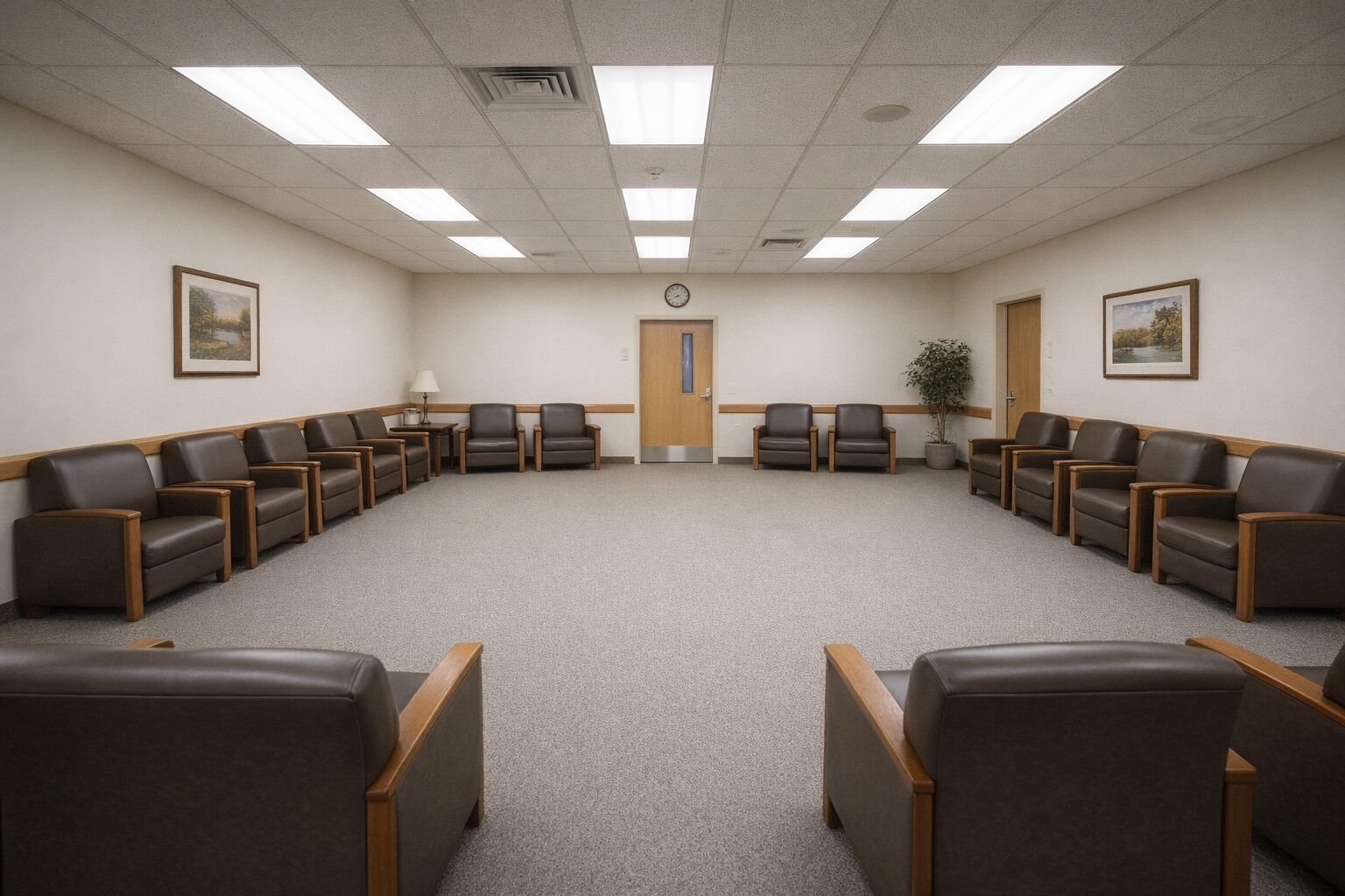
At first glance, this common room looks perfectly safe. The lighting is bright. The walkways are clear. Staff can see the entire floor.
So why does it feel dead?
Walk into almost any retirement home, assisted living facility, or senior care common room and you will find the same thing. Heavy vinyl armchairs pushed perfectly flat against the four walls. A massive empty carpeted center. Plenty of room to move through. Almost no room to gather.
The room is physically open but socially closed.
Residents sit on the perimeter because the geometry gives them nowhere safe to do anything else.
They are not avoiding company. They are avoiding the crossing cost.
What the room is currently saying
The room is saying: sit down, stay put, and look straight across the void at whoever ends up opposite you.
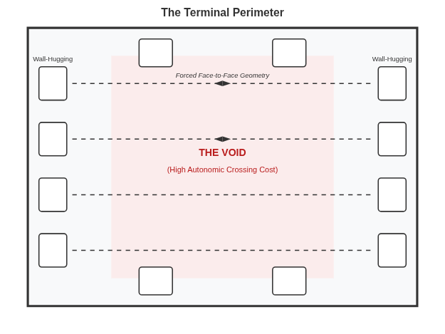
There is no social middle. No shared focal point. No object in the center to soften the pressure. No low-stakes reason to drift closer. Just a ring of chairs and an exposed gap between them.
That geometry matters more than most operators realize.
For a resident dealing with mobility limits, hearing loss, cognitive fatigue, or plain old social weariness, the empty center is not neutral space. It is a socially expensive crossing. To speak to someone else, you have to enter the open, approach head-on, and generate a conversation from nowhere.
Most nervous systems decline that invitation.
The result is predictable. Residents stay parked at the edge. They protect what little refuge the room gives them. They watch. They wait. They leave. Staff may read that as low engagement or resident preference. Often it is geometry.
The OED Read
This room is failing on the Shared Attention lever.
Shared Attention is what lets two people be together without the full pressure of being directly about each other. It is the side-by-side thing. The puzzle. The table object. The view out the window. The neutral third point that lets connection happen indirectly.
This room offers none of that.
It parks residents at the perimeter and forces the hardest possible social move: face-to-face contact across an exposed gap with nothing in between to absorb the pressure.
Prospect-refuge theory helps explain why the silence feels so immediate. People want to feel anchored. They want to see without feeling too exposed. In this room, the back may be protected by the wall, but the front opens onto a large social no-man’s-land. The resident is technically seated, but not settled.
There is also a metabolic cost. A body already managing limited energy does not enter a room like this and think in abstract design terms. It makes a rapid nervous system calculation.
How visible am I?
How much effort will this take?
Can I leave easily if I need to?
The room answers badly.
So the body does what bodies do. It conserves. It stays put. It avoids the social risk. The room produces silence not because the residents are antisocial, but because the invitation is wrong.
The Fix
You do not need a renovation.
You do not need to buy a full new furniture package.
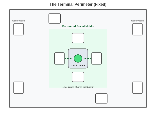
You need to break the void.
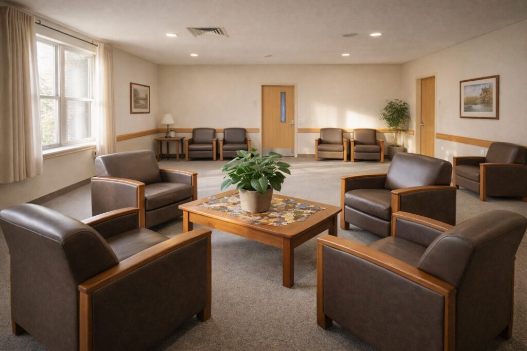
Pull four chairs off the wall. Group them around a low, sturdy coffee table, slightly off-center. Not in the exact middle of the room, and not pressed back to the perimeter. Then place something real on the table. A partially finished jigsaw puzzle. A stack of local history books. A large structural plant. Something with presence. Something the eye can land on.
Now the room has a social middle.
Now it has a Third Object.
That one move changes the ask. A resident no longer has to cross the room in order to perform a conversation. They can approach the object. Hover at the edge. Rest a hand on the chair. Make one remark about the puzzle. Comment on the plant. Join for thirty seconds and leave if they want.
That is what low-stakes gathering looks like.
The Business Implication
Facilities spend thousands of dollars on scheduled activities trying to manufacture engagement in rooms whose baseline geometry suppresses it.
That is backwards.
When the room itself supports quiet, self-directed interaction, staff carry less of the burden. Residents do not need to be constantly activated from the outside because the room finally stops taxing them. Families on tours notice the difference immediately. A room with gentle, organic social life feels humane. A room full of parked chairs feels managed.
Fix the geometry and you lower the autonomic load on every body in the room.
That matters operationally. It improves resident experience. It improves family perception. It raises the odds that the common room becomes a place people actually choose, not a room they pass through on the way somewhere else.
The Scene
A resident walking down the hall notices the puzzle on the table.
They slow. They rest a hand on the back of one of the clustered chairs. Another resident looks up and says, “Blue sky pieces are the hardest.”
A reply comes back without strain.
Three sentences later, something has happened that no activity calendar could force.
Nobody designed that moment. The geometry did.
Most rooms do not need a renovation. They need a better invitation.
Where Else the Terminal Perimeter Shows Up
The Terminal Perimeter is the senior-care version of a broader spatial failure: seating arranged for storage, supervision, or circulation instead of gathering.
You see it in therapy waiting rooms where every chair faces the opposite wall.
You see it in hospital family lounges where the center stays empty and everyone clings to the edge.
You see it in church fellowship halls, community centers, and rec rooms where the furniture says “park here” but never says “come closer.”
Once you see the dead center, you start seeing it everywhere.
Your room is already telling people whether to stay or go. Most owners never hear it.
For $97, I’ll tell you exactly what it’s saying, why, and what to move to change the message. You get a full written diagnosis within a week. No renovation, no new furniture, no guesswork. Order now.